

How the Colors in Your Home Quietly Shape Your Emotions
Have you ever noticed how the colors in your home can instantly make your shoulders drop the moment you walk into a room? Or, on the other hand, have you ever sat in a space that somehow made you feel restless, even though everything looked perfectly tidy?
As we curate our homes, it becomes clear that our choices do much more than simply make a room look beautiful. The colors in your home can influence how a space feels—and how we feel while spending time in it.
Color is not just an aesthetic choice; it can be a powerful psychological stimulus. According to Dr. Mary Gregerson, past president of the American Psychological Association’s Society for Environment, Population, and Conservation Psychology, “Color affects you totally, with both your mind and your body responding together to the outside stimulus.”
Once we understand a little about why certain colors make us feel calm, energized, or even restless, decorating becomes more intentional. We’re not just choosing pretty shades for our walls—we’re creating an atmosphere that supports the way we want to live.
So, let’s take a closer look at the fascinating psychology of color in interior design and how you can use it to create a home that feels more like you.
The Science of the Spectrum: How Our Brains See Color
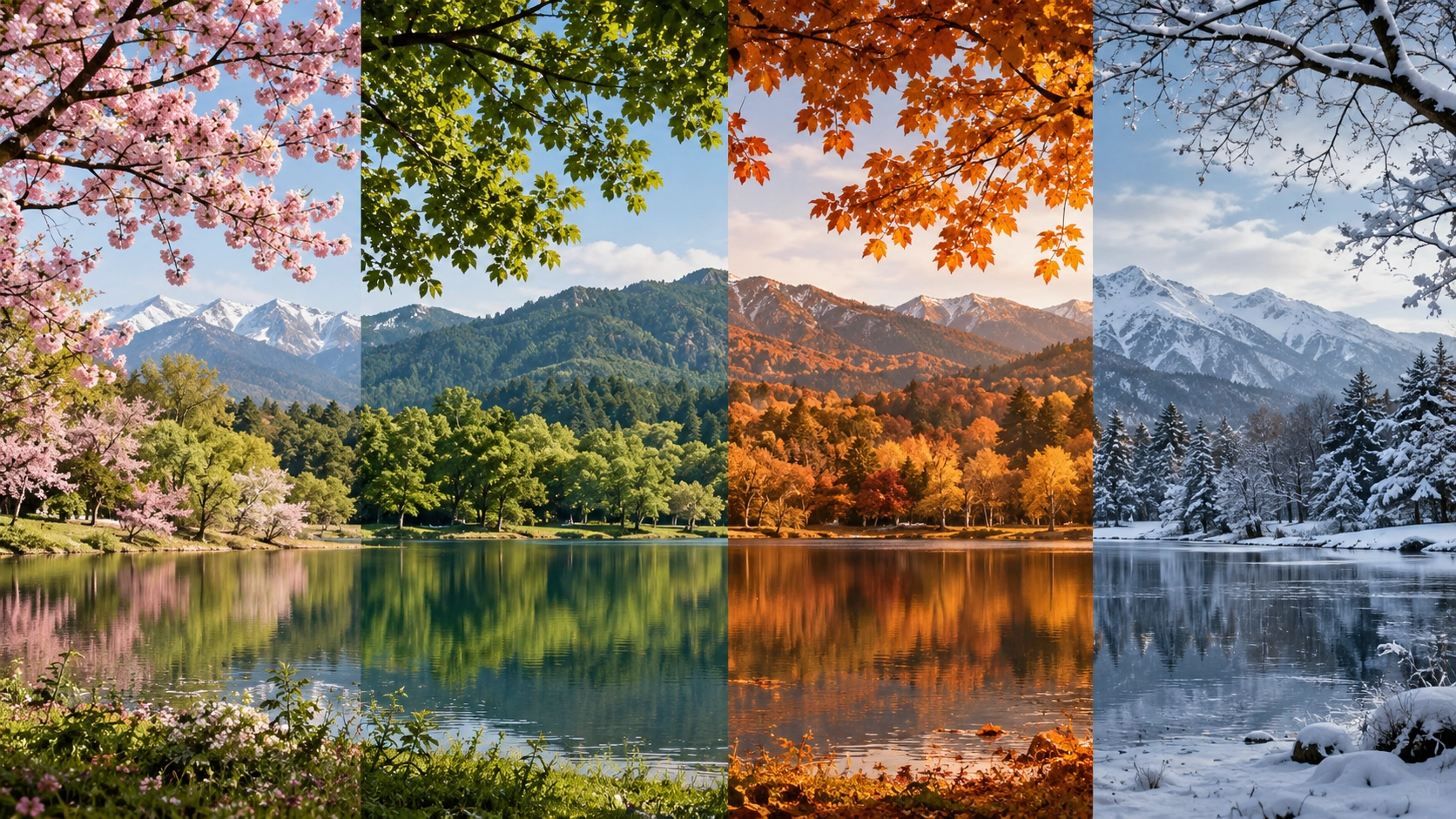
To understand how color influences emotion, we have to look a little beneath the surface of design and into environmental psychology.
In 2012, psychologists Andrew Elliot and Markus Maier introduced the Color-in-Context Theory. The theory explains that our responses to color come from two different places: evolutionary biology and learned cultural associations.
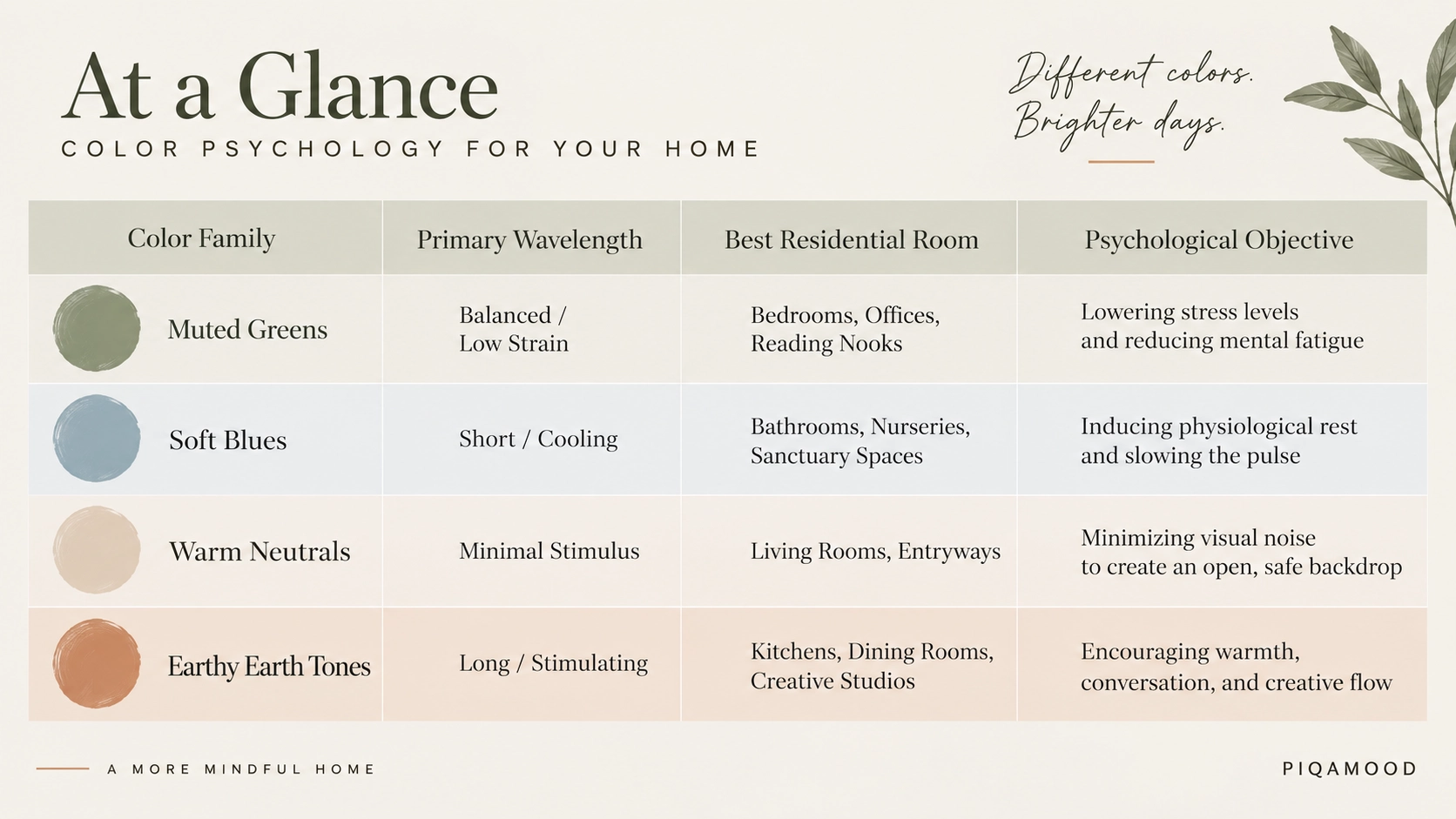
Biologically, different colors have different light wavelengths that stimulate our bodies in different ways. Cooler wavelengths, such as blues and greens, require our eyes to adjust less, which can contribute to a state of physiological rest. Warmer wavelengths, such as reds and oranges, require more processing from our eyes and can subtly increase heart rate and arousal.
When we bring these hues into our homes, we are, in a way, setting the emotional background music for everyday life.
And that’s where color gets interesting.
The Gentle Grounding of Earthy Greens
The Emotional Impact: Renewal, tranquility, safety, and balance.
The Psychological Reason: Green sits directly at the center of the visible light spectrum, making it relatively easy for the human eye to process. Our evolutionary brains also associate vibrant greens with abundant water, shelter, and food sources. These associations can create a subconscious feeling of safety and connection with nature.
How to Style It: According to design insights from HGTV, softer “Soft Autumn” tones such as sage, olive, or muted buttercream-green can create a visual harmony that feels naturally calming. These shades work especially well in home offices and bedrooms—places where you may want your mind to slow down after a long day of screen time.
Sanctuary Styling Tip: You don’t have to repaint an entire room to bring in the grounding quality of green. Try introducing it through plants, textiles, artwork, or a few thoughtfully chosen desk accessories. Even a small touch of forest green can change the mood of a corner.
The Vast Serenity of Cool Blues
The Emotional Impact: Deep calm, mental clarity, trust, and stability.
The Psychological Reason: Research into architectural and spatial environments has explored blue’s relationship with feelings of calm and concentration. Blue also naturally reminds us of two of the most expansive elements in nature: a clear morning sky and a calm ocean.
How to Style It: Blue doesn’t necessarily have to make a room feel cold. Current paint trends, such as the HGTV Home by Sherwin-Williams Color of the Year, Quietude, lean towards soft, organic blue-green tones. Pairing these misty blues with natural wood tones can help keep a room feeling warm, grounded, and peaceful.
Sanctuary Styling Tip: A blue accent doesn’t have to mean a blue wall. Try a framed artwork, cushion, rug, or even a small decorative piece in an ocean-inspired shade. It’s an easy way to introduce a sense of calm without changing the entire room.
The Enveloping Warmth of Soft Neutrals
The Emotional Impact: Comfort, safety, luxury, and clarity.
The Psychological Reason: Pure, stark white can sometimes resemble a clinical or sterile environment. Warm neutrals, on the other hand—such as alabaster, sand, beige, and warm taupe—can create a softer, more comfortable visual environment.
These low-stimulus shades give the eyes room to rest, especially when the rest of our lives are already filled with screens, notifications, and visual clutter.
How to Style It: Prominent design voices at Architectural Digest often highlight how neutrals can become much more interesting when layered thoughtfully. Pairing lighter shades with earthy dark sand, taupe, or soft charcoal creates contrast and gives the eye a natural place to rest while maintaining that feeling of quiet luxury.
Sanctuary Styling Tip: The secret to making neutrals feel inviting is layering. Combine different textures, materials, and slightly different shades instead of keeping everything exactly the same. A neutral room can be calm without ever feeling boring.
The Vibrant Energy of Warm Terracotta and Ochre
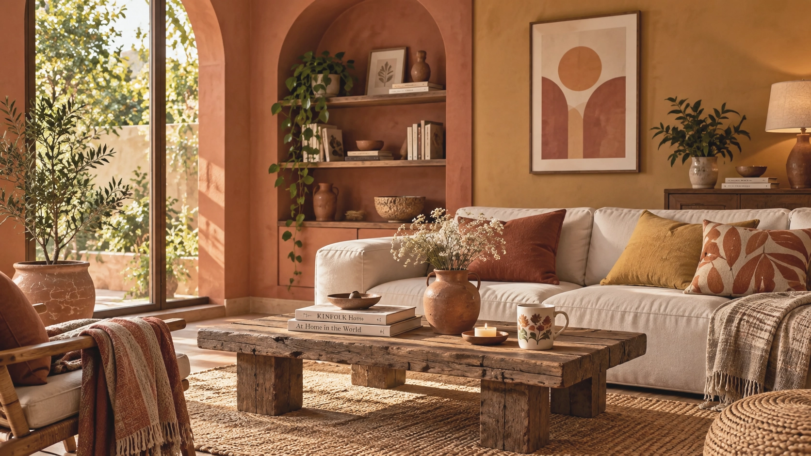
The Emotional Impact: Sociability, creativity, optimism, and appetite.
The Psychological Reason: High-energy colors such as true red and bright yellow can sometimes overstimulate a residential space, particularly when used in large amounts. They may evoke feelings of restlessness or irritation.
But soften those colors into earthy variations—such as terracotta, burnt orange, and warm ochre—and they can bring a very different energy to a room. These shades feel warm, inviting, and connected to natural landscapes, making them particularly suited to spaces where people gather.
How to Style It: Terracotta and ochre work beautifully in rooms centered around connection, such as dining rooms, kitchens, and living areas. And if painting an entire wall in terracotta feels like too much of a commitment, don’t worry. You can introduce the color through smaller decorative accents and let it appear in little moments throughout the room.
Sanctuary Styling Tip: Try a terracotta mug, artwork, cushion, vase, or other small accent to bring a little warmth into your everyday surroundings. Sometimes, one unexpected splash of color is all a room needs.
Reevaluating Under Your Own Light
Before you pick up that paintbrush, there’s one more thing to keep in mind: context is everything.
The way a color looks—and the way it makes you feel—can change depending on the light in your home. A shade that feels fresh and airy in the morning can look completely different by evening when the light becomes warmer and softer.
Color perception can shift quite dramatically throughout the day. A soft blue, for example, might look bright and crisp in natural morning light but take on a moodier, more muted quality under evening shadows.
So before committing to a color, give it some time. Try a few paint swatches on different walls and look at them at different times of the day. Notice how they look in natural sunlight, on a cloudy afternoon, and under the warm glow of your evening lamps.
After all, you’re not just choosing a color from a paint card—you’re choosing how that color will live with you.
Painting Your Emotional Sanctuary
Your home is more than a collection of rooms, furniture, and carefully chosen objects. It is the backdrop to your everyday life—and the colors around you can quietly influence the way that life feels.
Instead of constantly following the next big design trend, pay attention to the shades that genuinely make you feel calm, grounded, energized, or inspired.
Maybe that means a soft sage green that makes your workspace feel closer to nature. Maybe it’s a warm neutral that helps your bedroom feel more restful. Or perhaps it’s a little terracotta that brings warmth and creativity into your everyday spaces.
There is no single perfect palette. The best colors for your home are the ones that feel right when you are living in them.
And once you’ve found those colors, you can bring the feeling through the rest of the room with thoughtful little details—art, textures, ceramics, textiles, and objects that complement the mood you’ve created.
At Piqamood, that’s what we love about home décor: the little things can help tell a bigger story. Explore our collection of art and home accents at piqamood.com and find pieces that feel right for your space.
So, take another look around your home.
What story are your walls telling you—and what mood would you like to create next?
Let Your Home Set the Mood
There is no single “right” color for every home—or every person. The beauty of color is that our relationship with it is personal. A shade that feels peaceful to one person might feel completely different to another because our experiences, memories, culture, and surroundings all play a role.
That’s why decorating your home isn’t really about following a fixed color rulebook.
It’s about noticing how a space makes you feel.
Maybe you need the grounding quality of green after a long day. Maybe soft blue helps you slow down. Maybe warm neutrals make your home feel like a place to exhale. Or perhaps a little terracotta is exactly what your morning needs.
Your home has a mood. Choose the colors that help create yours.
Thank you for reading us !
Follow us for more
Namsate and thank you !